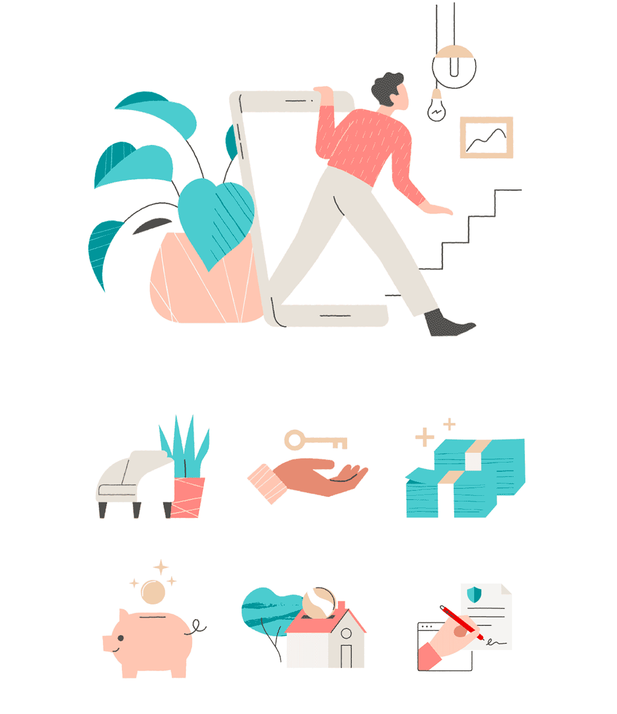
Redfin Illustration System 2023
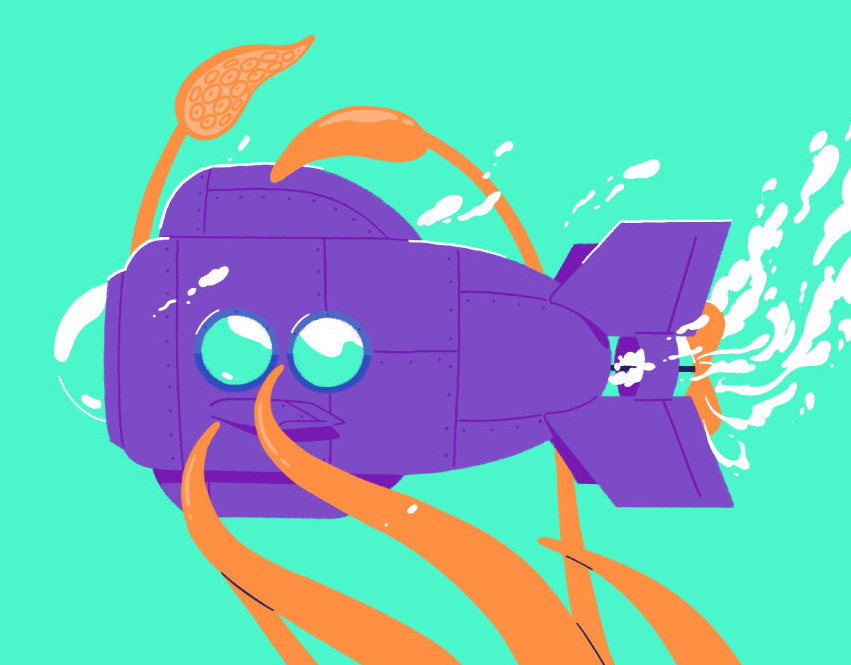
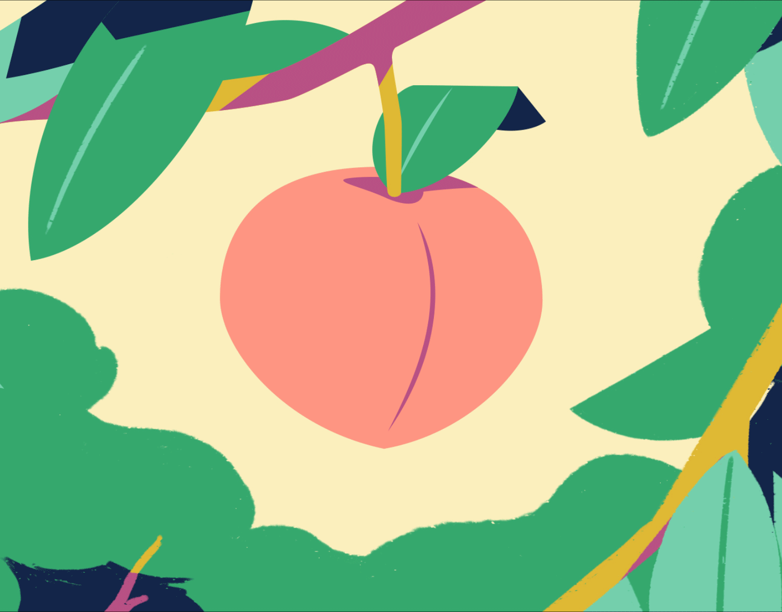
Moments of magic throughout the home-search journey are brought to life through delicate scene building, hand drawn line work, and a human-centered experience.
This project was the ultimate conglomeration of my digital skills (design, motion, and illustration). My background working within design systems helped me think critically about scalability, as well as replicability. As part of this initiative, one of my objectives was to make sure that the new illustration style would also lend itself to motion design and animation. As I designed each illustration, I kept motion top of mind, designing compositions that could be easily brought to life. Although my team consisted of talented designers, none would consider themselves illustrators. This posed one of the greatest challenges: creating a style that could work for everyone.
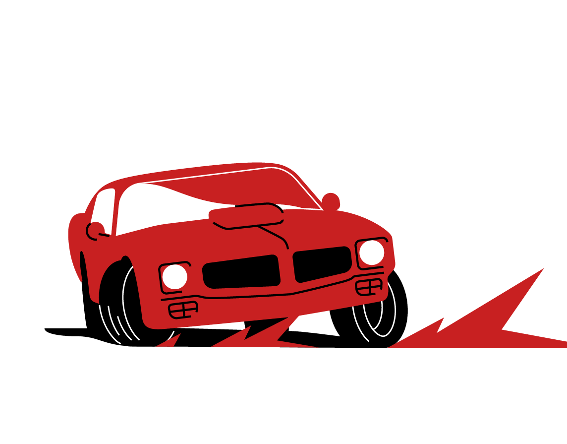
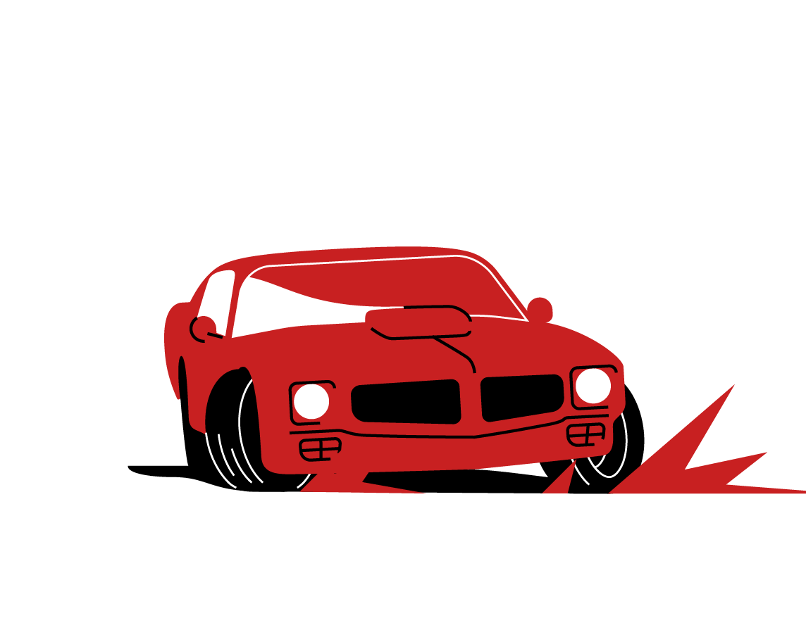
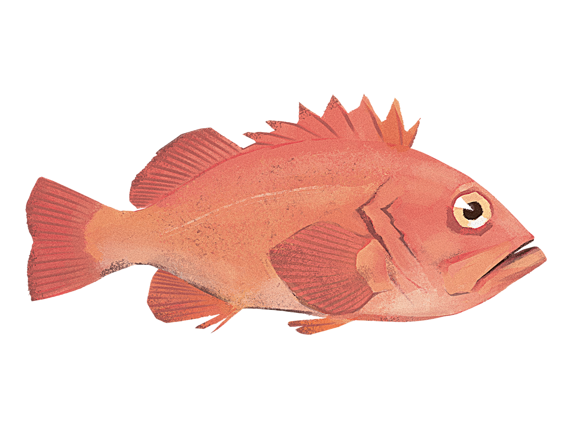
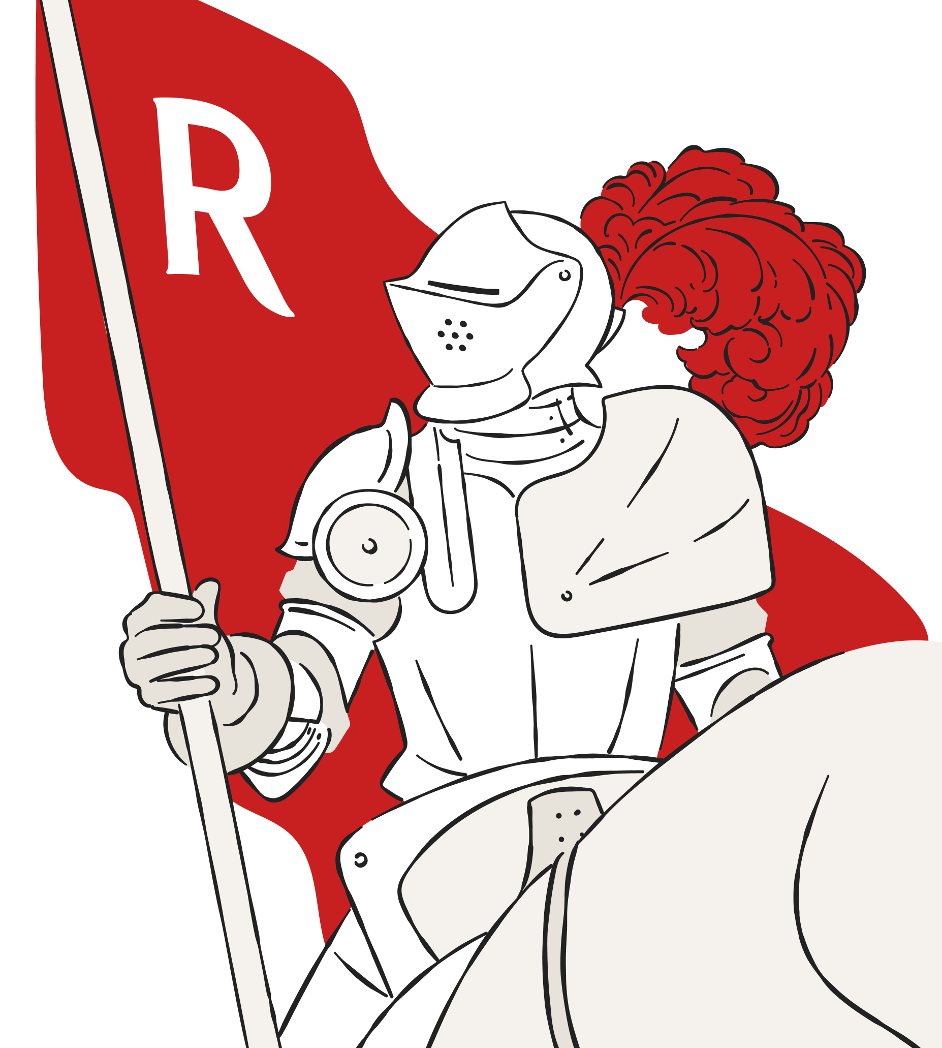
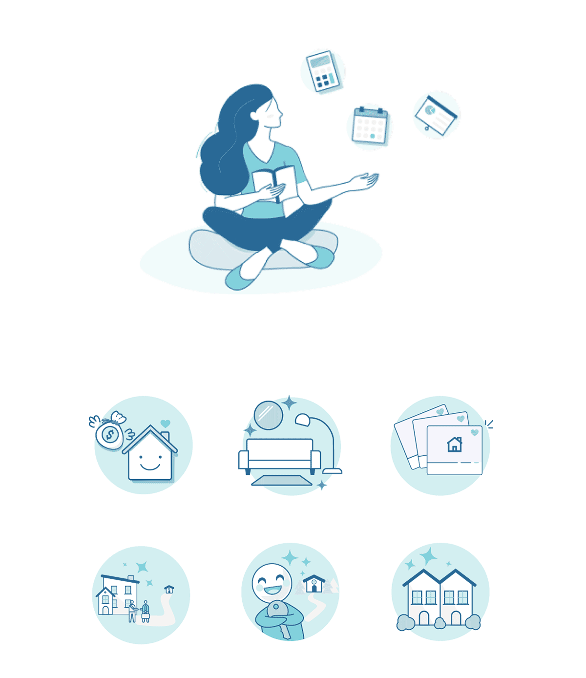
I led a small team of designers over the course of three months, coordinating with stakeholders, motion designers, and engineers to ensure that we were meeting our deadlines and milestones for the new system. The earliest stages of the process consisted of research and auditing. We identified every instance where illustrations were currently being used throughout the Redfin brand and quickly discovered a multitude of different styles that were quite obviously not playing by "the rules". Our legacy illustration system was originally designed in 2008, and it was evident that that style had outgrown its shell. We also found illustrations from my 2019 attempt at designing a new illustration system (strongly influenced by the "Corporate Memphis" trend; circa 2017). Though it was half-baked, we found illustrations that had been published to both web and mobile pages, and though these illustrations were good, they were sparse and did not reflect the personality or tone at Redfin.
2008
2019
The team and I worked closely to create a style that felt both unique and replicable. Pioneering new techniques and new programs, we explored ways to give a human-touch to our illustrations. Once we landed on a north star, it was time to start building our library of assets. Collaborating with engineers, we deciphered and categorized frame sizes and standardized a system for uploading our designs to Redfin's UI-components library, allowing for seamless hand-offs to our product teams and developers.
Each designer was given a tablet and stylus to use in the creation of these new assets, but it quickly became clear that not everyone was on board with this, literal hand-drawn technique. Pivoting quickly to find a way to satisfy the needs of everyone on the team, I was able to create tools within Adobe Illustrator that would allow designers to use more familiar methods to create these new assets while still adhering to the aesthetic and requirements of the new system.
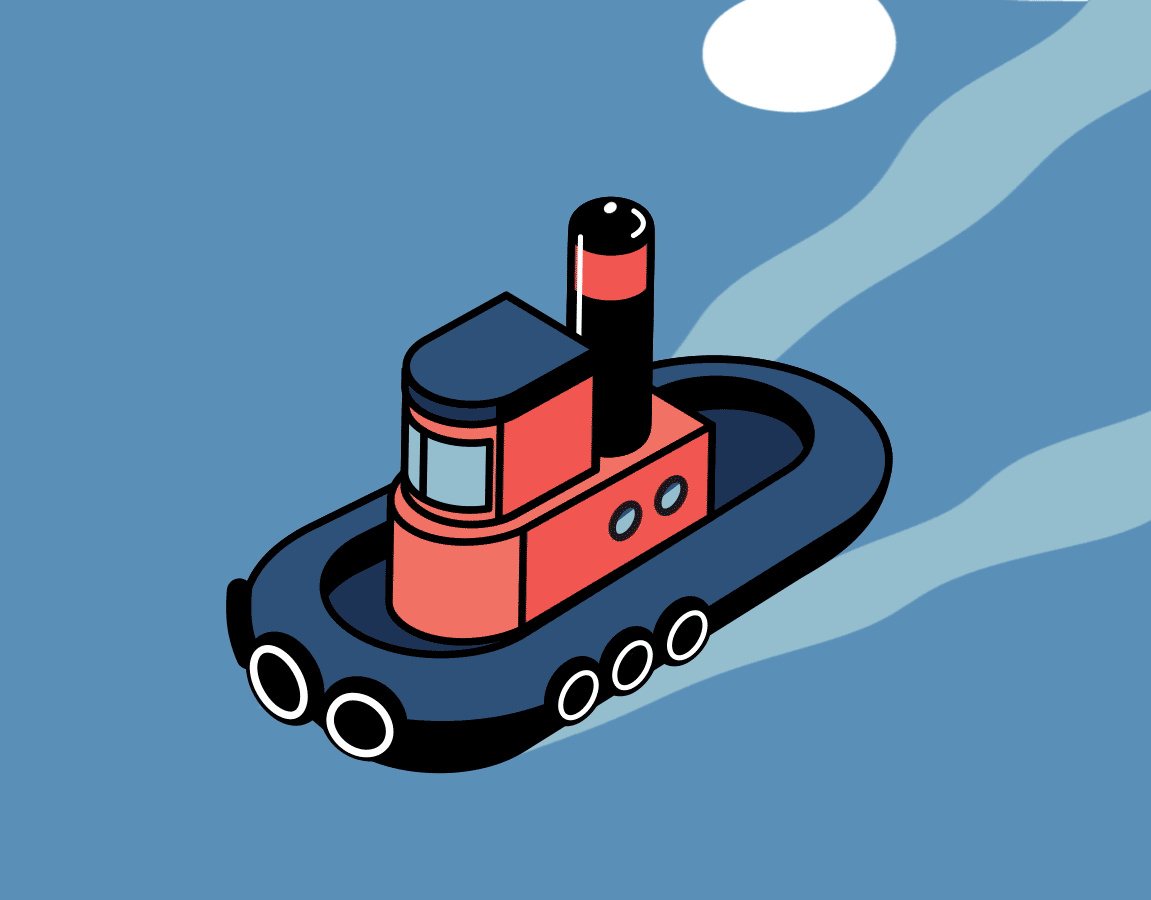
Size Categories
Duotone
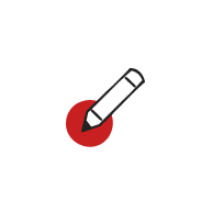
Simple icons | 48x48px


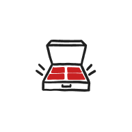


Medium
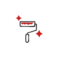
One piece of the story | 128x128px
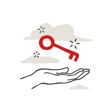


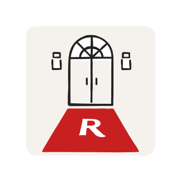

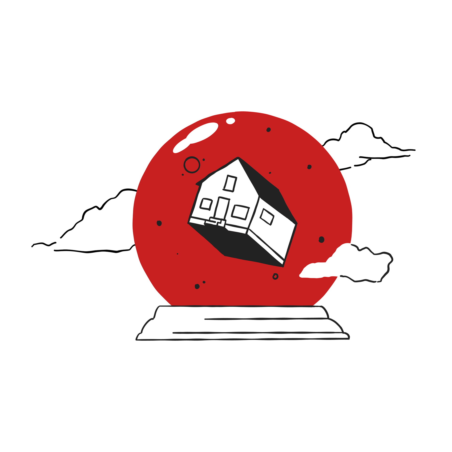
Spot
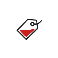
Broader concepts, summarizing a story | >128px

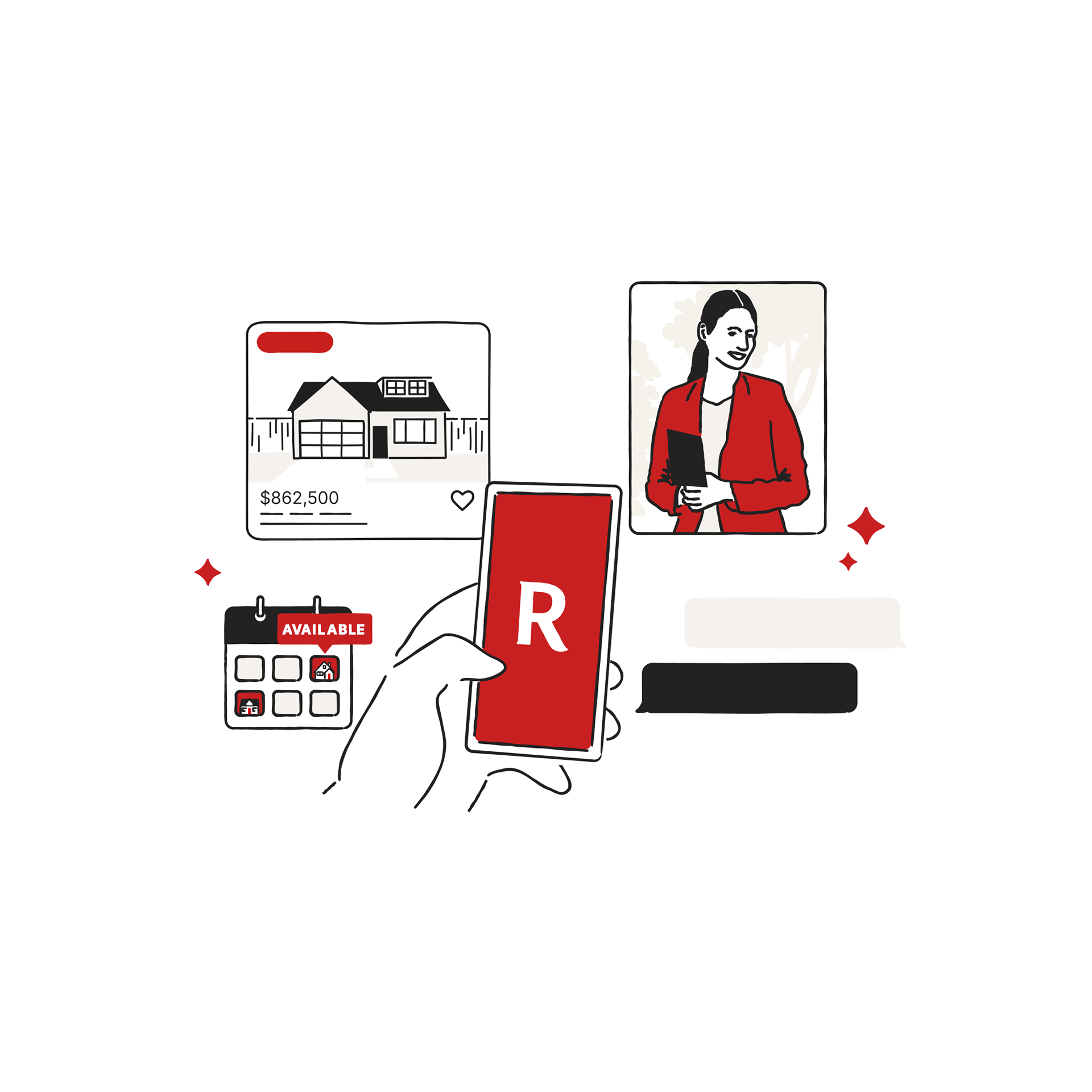
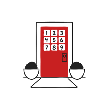
Scene
The full story | Composition and scale are fluid
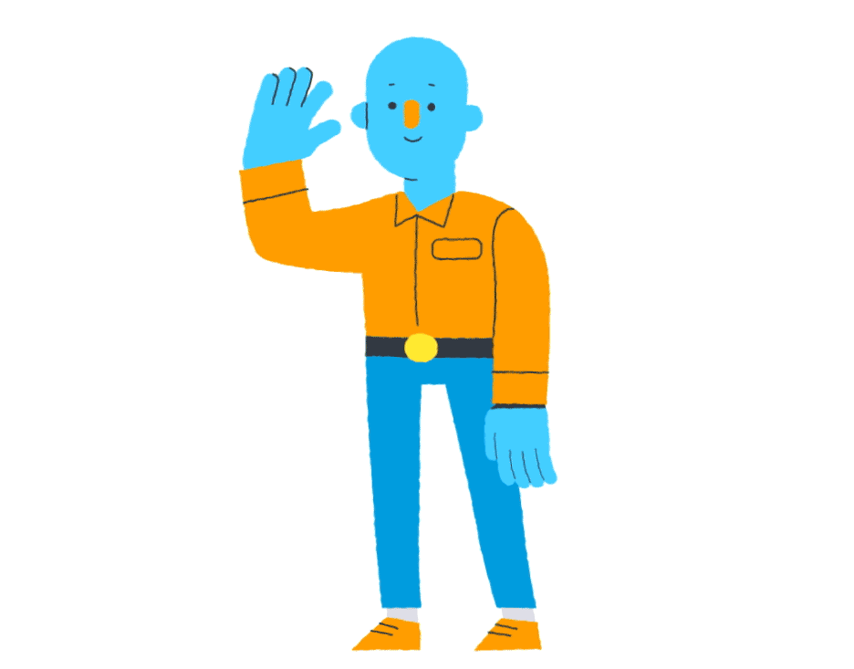
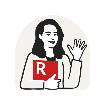
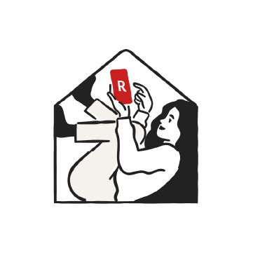
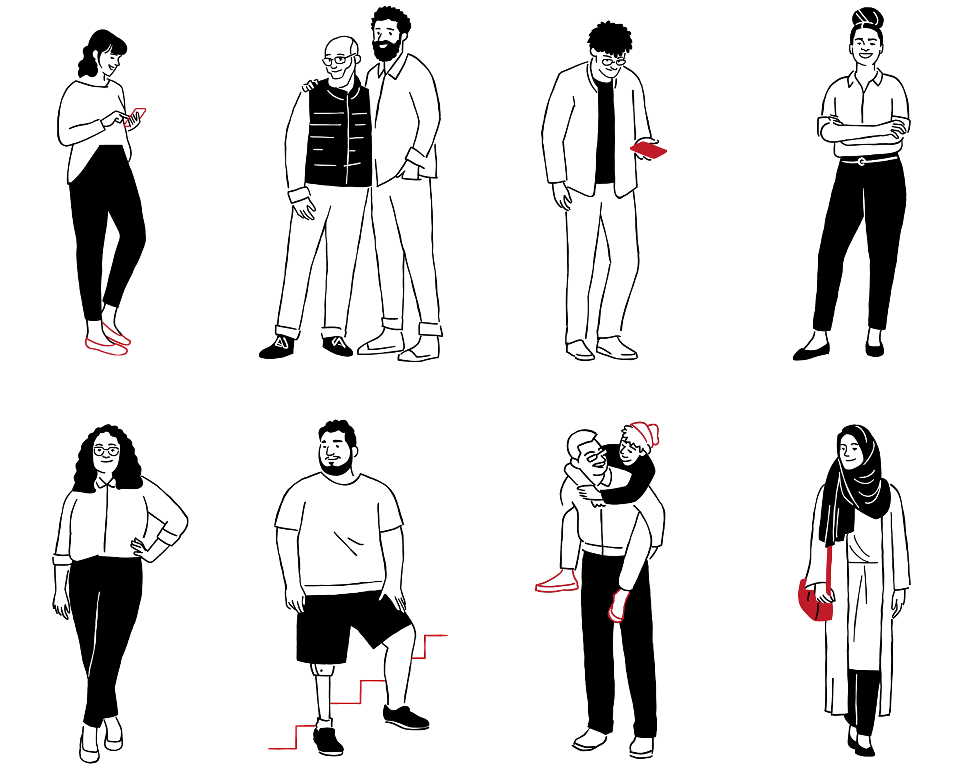
People
The approach to representing people was simple and true, drawing inspiration from people of all races, ethnicities, and body types.
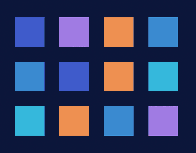
With a limited color palette one of the greatest challenges was showing diversity without using skin tones. By letting our character’s humanity and the context of the scene tell the story rather than relying on stereotypes or visual generalizations to signal identity.
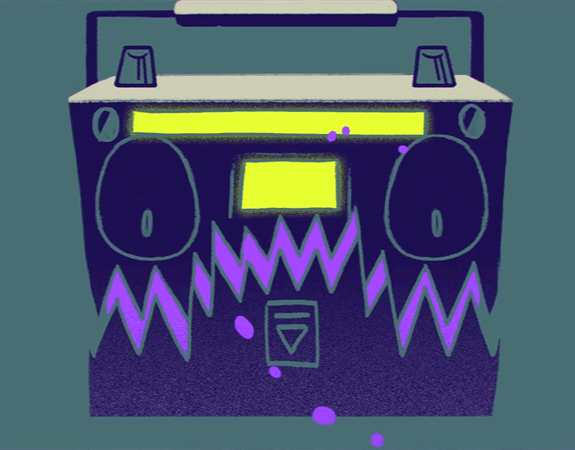
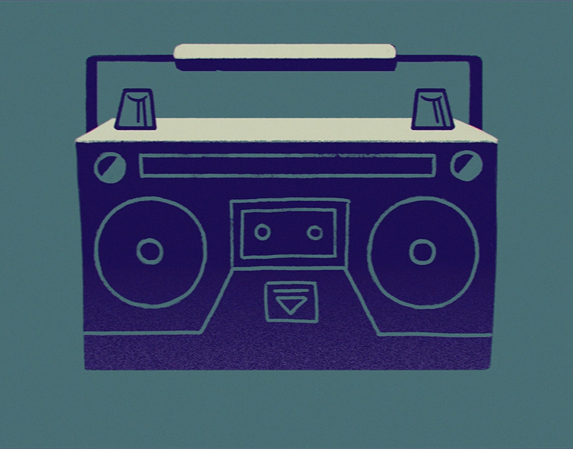
Motion
Many of our icons suggest motion in their composition, but it's not until you actually apply motion that these illustrations truly come to life. About 80% of the illustrations that we added motion to were lottie-JSON exports, and the remaining were GIFs. With the launch of Redfin's new illustration system also came a series of digital ads that I animated
[you can check out that project here].
[you can check out that project here].
Spot

Medium


Duotone


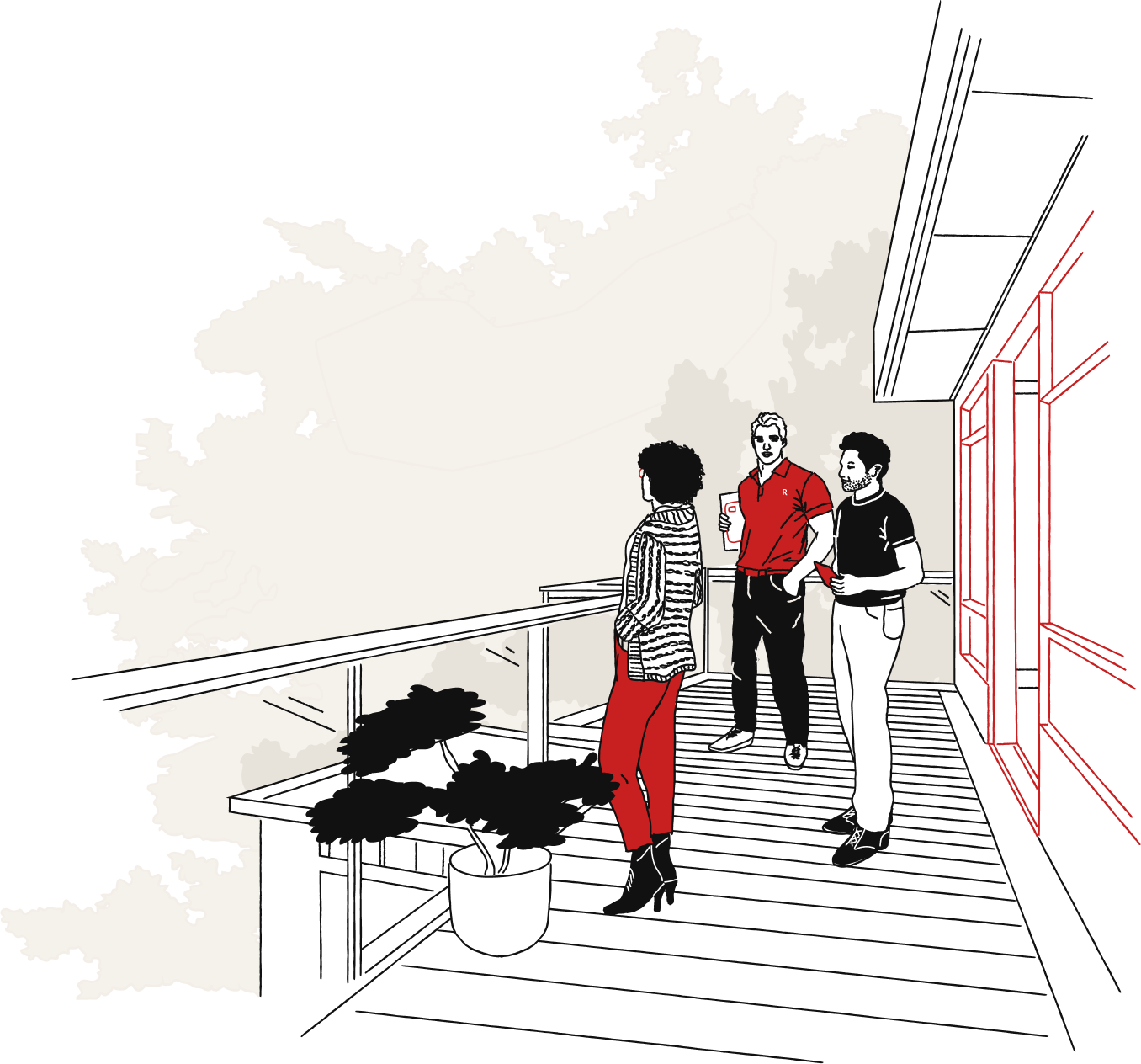
In SITU Examples
Web Pages
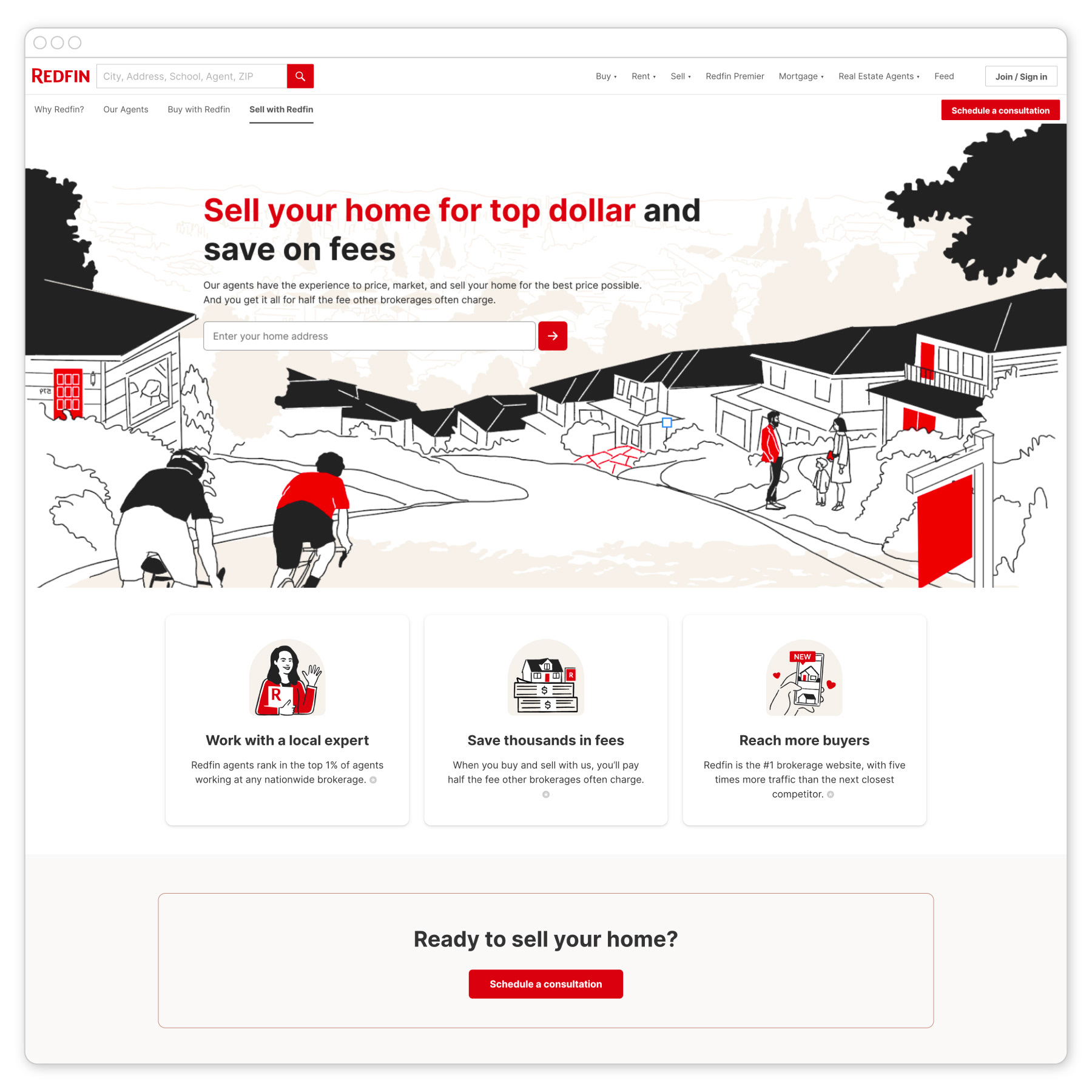
Sell with Redfin
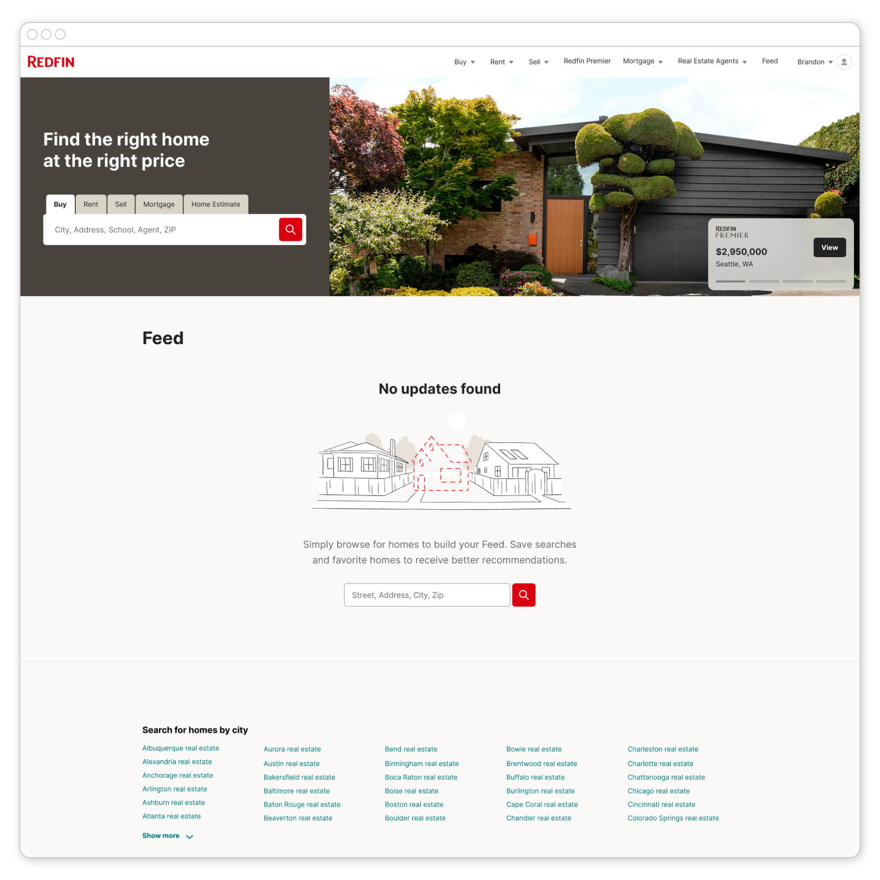
Empty Feed
Mobile
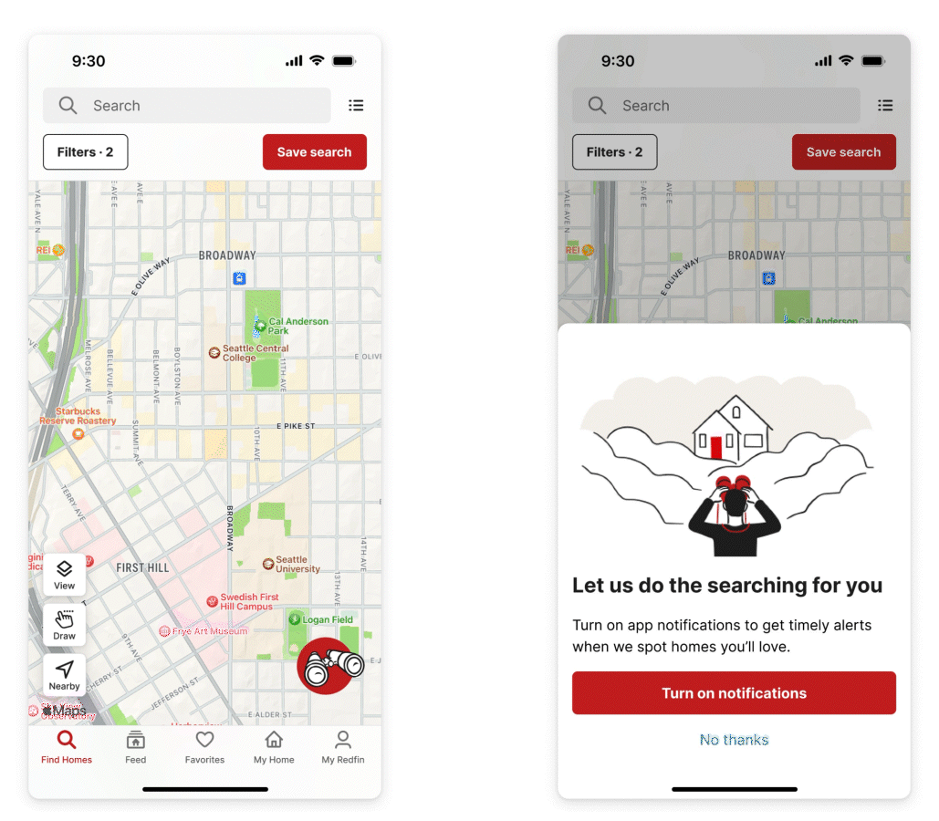
Search Notification Prompt
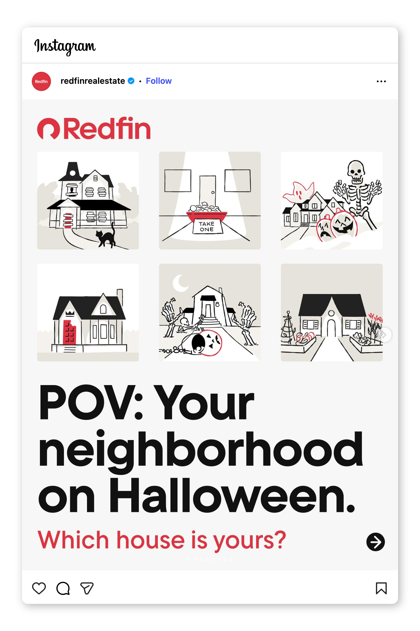
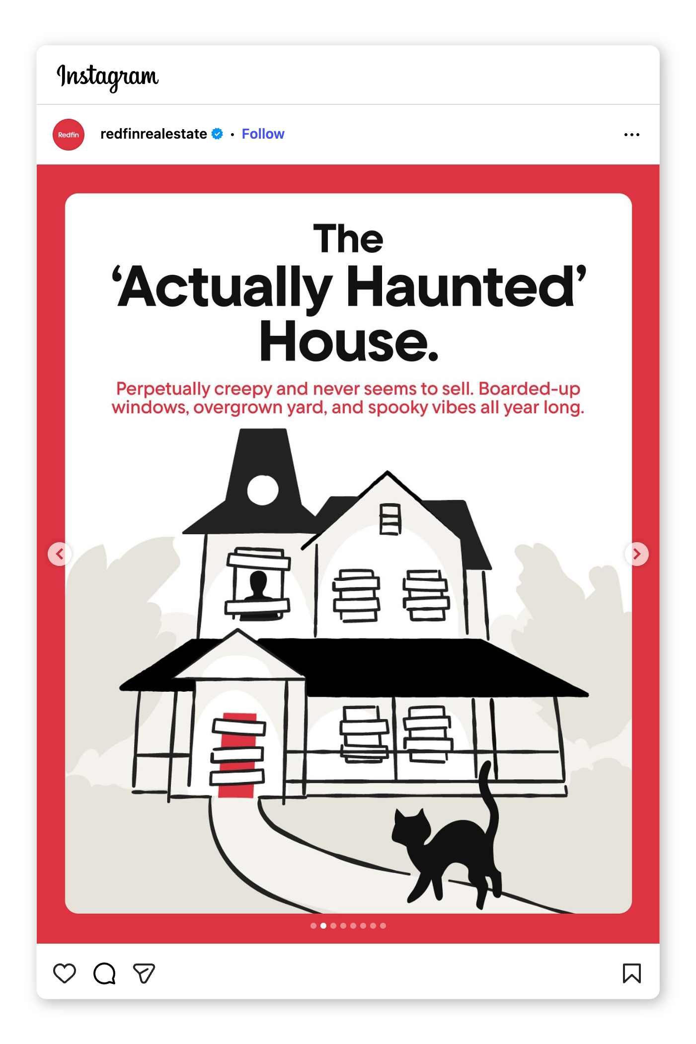
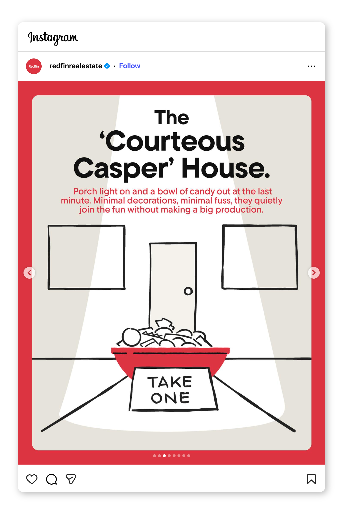
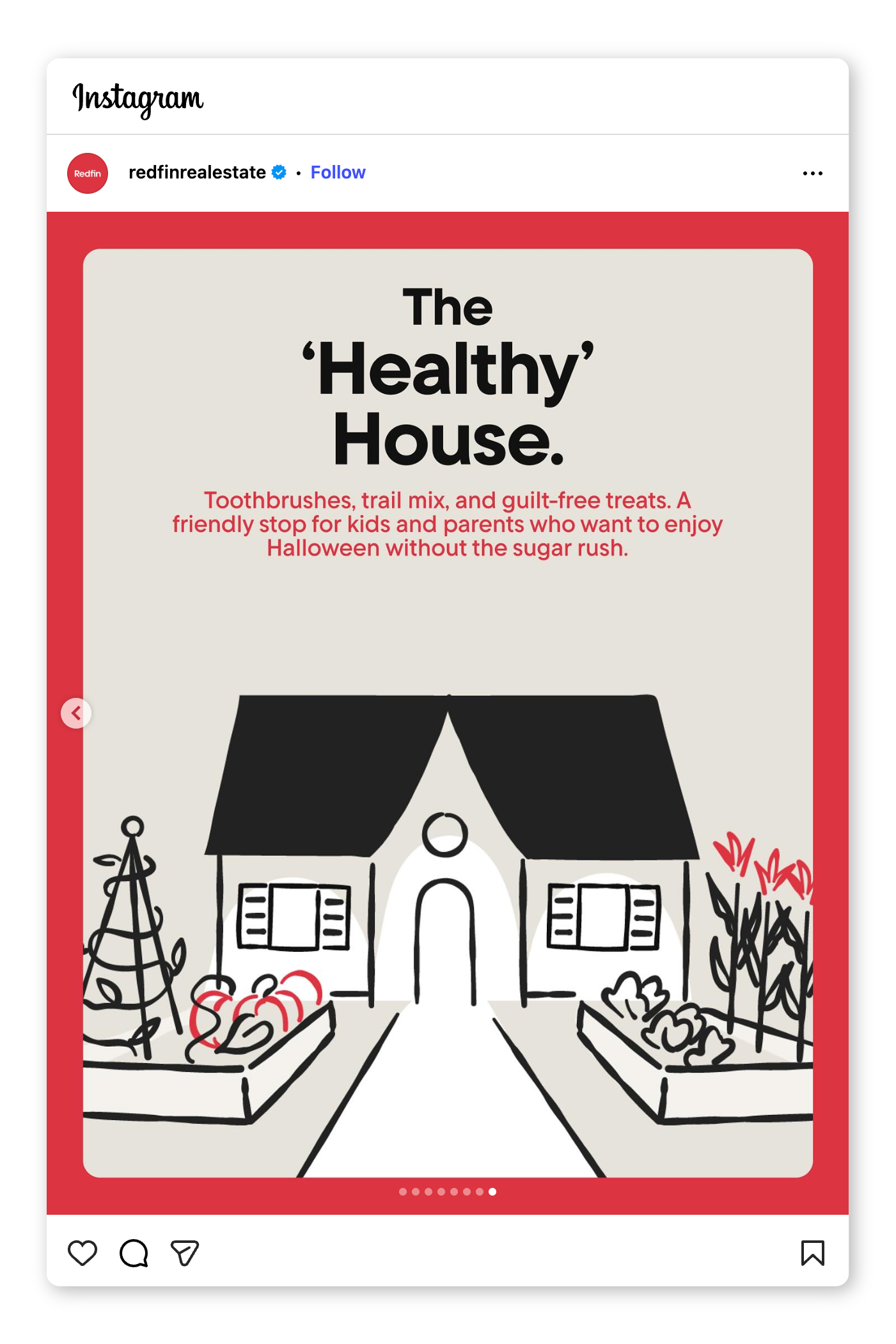
Social
Team Portraits


Design Team:
Kevin Mar
Nathaniel Bergstein
Tito Soto
Dan Grazi